

How McKinsey designs data-heavy slides

By Paul Moss
Join 100k+ subscribers on our YouTube channel and enjoy highly engaging lessons packed full of best practices.
Overall, mckinsey does a good job of showing a lot of data in a small space by having a strong title, choosing the right chart, organizing the information into clear sections, and bolding the important parts of the text..
In this post I’m going to break down a realistic consulting slide from McKinsey. I’ll show you how they’re able to show a large amount of information in one slide, while still being able to communicate a clear message. What might look like a dense mess of text and numbers, is actually a carefully crafted slide with a clear structure and insightful takeaways.
If you’re new to this site, make sure you check out our other consulting slide breakdowns. And when you’re ready, take a look at our advanced PowerPoint and presentation building courses where you can learn to create presentations like a top-tier consultant.
FREE Slide Design Course
Enroll in our free 5-day email course and learn how to design slides like a McKinsey consultant.
Complete hands-on exercises , review a realistic consulting case study , and get personalized feedback from your instructor!
Plus get a free copy of our Top 50 PowerPoint Shortcuts for Consultants cheat sheet.
Learn More ➔
Success! Please check your email.
We respect your privacy. Unsubscribe anytime.
The slide I’ll be reviewing is about identifying the future demand for electricity in the U.K. and finding ways to reduce that demand.

“Capturing the full electricity efficiency potential of the U.K.” McKinsey, November 2012
This slide in particular is showing how much the UK could potentially reduce their yearly electricity demand. The title says, “If implemented in full, electricity efficiency measures have the potential to reduce UK electricity demand by (about) 146 TWh per annum by 2030.”

There’s a nice waterfall chart on the left with some details, then on the right there’s a box that shows key insights, and a box that shows comments. The first thing to note is the overall organization of the slide. When designing your slide it’s important to clearly separate the different categories of information on the slide, especially if the information looks similar. For example, the two boxes of text could easily blend together, but they’ve categorized them into key insights and comments, which makes it a little easier for the audience to read and understand.

I also really like the specificity of the title. They’re telling you exactly what they want you to know, including the exact number, which is really important on slides like this where the amount of information can be disorienting. Your goal is always to make it as easy as possible for the audience to understand the message you’re trying to communicate, and little things like this make a difference.
Alright, let’s talk about the chart just a little bit. It’s a waterfall chart, which is best used when you’re trying to show how you get from one value to another. In this case they’re showing how you get from the 2030 “policy off” projection – basically the expected demand in 2030 if they do nothing – to 2030 demand assuming ‘full abatement potential’ captured – which is just the number they think they could get to if they did everything right. Then they’ve also included an extra column that shows 2030 DECC central “policy on” which is the Department of Energy and Climate Change’s projections for the current policy.

So at its core, the chart is showing where the potential electricity savings could come from, represented by each of the different categories: 63 TWh from residential, 42 from commercial, etc. And if you add these all up, the total is about 146 TWh, which is the number they’ve called out in the title.

There’s a few important keys to making sure your waterfall charts look good. The first is to make sure you include data labels on each column. It makes it much easier for the audience to understand the breakdown of each category. Putting the data labels on the Y axis for example, would make it hard to grasp the size of each individual column because they’re sort of floating in space.
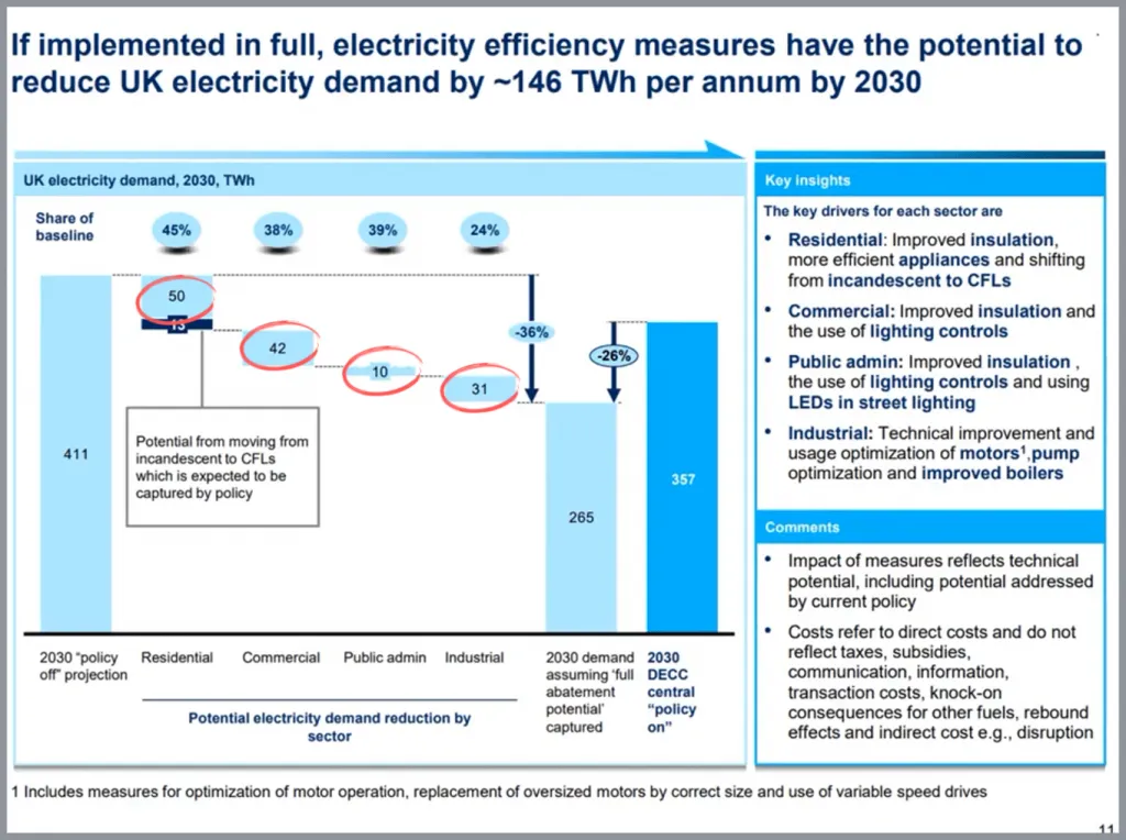
The second key is to include extra information on the chart, especially information that shows the difference between the major columns. They’ve called out the 36% number which gives the audience a good sense for the magnitude of the difference. They’ve also included the numbers at the top, which are a bit confusing at first, but provide good context. They’re meant to show how much each reduction makes up of the total for that sector. So for example, a reduction of 42 TWh for the Commercial sector is about 38% of the total expected demand for the Commercial Sector in 2030.

Then one other important key to building good waterfall charts is to use different colors to distinguish between the categories. In this case they’ve done it twice – to highlight a part of the Residential Sector demand reduction, then again, to show the expected demand with the policy in place. It is especially important to call out because the whole point of the project is to identify what they aren’t doing to reduce demand that they could be doing, which is represented by the difference between the two columns on the right. It doesn’t seem to be the emphasis of the slide per se, but the context is really important.

On the right hand side they’ve got two sections. One that says key insights, and another that just says comments. In the key insights box it shows where the reduction is expected to come for each category. For example, in Public Admin improved insulation, lighting controls, and LEDs are expected to be key drivers for the reduction in electricity usage.

I like that they’ve bolded the important keywords, especially considering how much text and information is on this slide. Small things like that can really make a difference. What I don’t like though, is their decision to call this box Key Insights. I don’t think the insights are from the chart, I think they’re just what they’ve called them: Key Drivers. I would have removed the subtitle line, and changed the title to Key Drivers. That would have made things a little more clear.

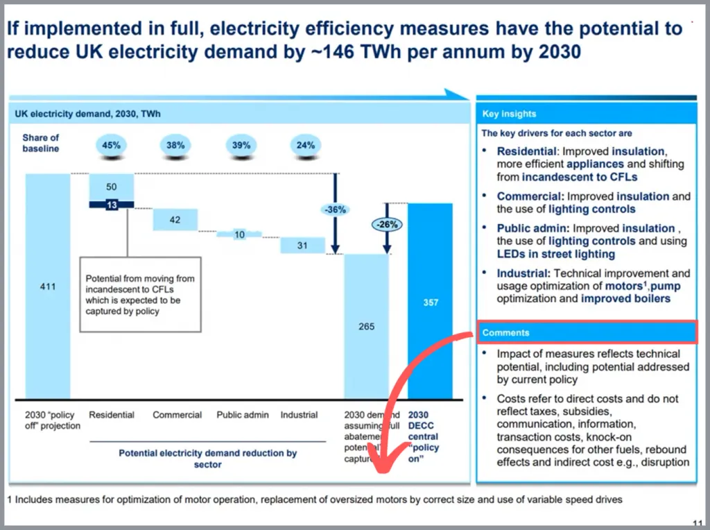
Then the box below is called comments, and if you read closely, it’s really just supplemental information that helps you understand the data. They could have easily moved it down to the footnotes section, which is probably what I would have done, but it’s not a big deal to have it where it is so I think it’s fine.
Overall, McKinsey does a pretty good job of showing a lot of data and information in a small space, while keeping it clear and readable. They do this by having a strong and attention-grabbing title, choosing the right chart and making the chart easy to understand, organizing the information on the slide into clear sections, and bolding the important parts of the text. The end result is a clear slide that would work well in a realistic client presentation.

- Print Friendly

5 Rules When Presenting Hard Data
May 8, 2017 / Blog, PowerPoint Design, PowerPoint Tips, Presentation Science Hard Data, presentation tips, public speaking tips

Business communication is a skill that, simple though it may appear, takes a lot of effort to master. Every professional, regardless of rank or specialization, ought to learn the basics of delivering presentations, as this skill can come in handy when relaying a new business opportunity or spreading news about the success of a new initiative. If your career leans more towards the technical side, it’s all the more important for you to grasp data storytelling at its fullest. It’s true that numbers and graphs can lend a credible air to your presentation, but wouldn’t it be a whole lot better if your audience can understand the information you feed them? The goal of business presentations after all is to inform, not to impress.
Pointers on Data Storytelling

1. Know the story behind the data
It’s unfair to expect your audience to make sense of hard data when you yourself can’t comprehend it. As a presenter, it’s your job to dissect a piece of information before presenting it to your listeners. Most importantly, as a data storyteller, you must learn how to extract convincing and relatable stories from hard numbers. Don’t limit yourself within technical bounds—instead, try to capture a creative idea or insight that will best communicate your message. By harnessing the power of storytelling , you can encourage your audience to be more engaged and cooperative.
2. Provide context when going technical
One of the common mistakes that presenters make is plunging right in on the actual data. Amateurs often don’t bother constructing a logical structure that allows for the smooth transition of ideas. If you’re serious about being an effective data storyteller, keep in mind that your main goal is to make sure that the audience finds meaning in your presentation—they must be able to translate the data you give them into their everyday lives. To make that happen, you simply need to provide context when treading on technical subjects. If you try hard enough, it shouldn’t be too difficult to make a connection between numbers and reality. The last thing you want to see is a roomful of people wearing befuddled—or worse, indifferent—looks. Your data-heavy presentation might make sense to you, but you have to assume that the audience are utterly unfamiliar with the concepts you’re sharing. As much as possible, veer away from technical language and use layman’s words instead. Try to strike an emotional chord with your audience. Yes, it’s a business presentation, but a little touch of personality won’t do any harm. In fact, if you employ the right strategies, pulling at your audience’s heartstrings can be more beneficial than you think.
3. Let your message sink in before advancing

4. Make an important detail prominent
The audience won’t remember everything you share them, so it’s important to underline the key points you want to impress on their minds. For maximum impact, capture, package, and present the core message in a moving and unforgettable way. You can do this visually by giving a core idea a slide of its own or by iterating it throughout your speech. To better highlight your message, eliminate everything that distracts from it. Clutter will only confuse your audience, so make a final run-through before presenting to ensure that only the most important elements will reach the audience.
5. Use imagery to paint vivid pictures

Crooks, Ross. “7 Ways Data Can Tell Your Story.” Visage. October 7, 2014. visage.co/7-ways-data-can-tell-story French, Katy. “11 Design Tips for Beautiful Presentations.” Visage. November 24, 2016. visage.co/11-design-tips-beautiful-presentations Ravilochan, Teju. “6 Principles for Making Your Pitch Unforgettable.” Unreasonable. July 31, 2013. unreasonable.is/6-principles-for-making-your-pitch-unforgettable Samuel, Alexandra. “How to Give a Data-Heavy Presentation.” Harvard Business Review. October 16, 2015. hbr.org/2015/10/how-to-give-a-data-heavy-presentation “Presentation Ideas: When Presenting Data, Get to the Point Fast.” Duarte. n.d. www.duarte.com/presentation-ideas-when-presenting-data-get-to-the-point-fast
Popular Posts
Save your deck: methods to recover an unsaved powerpoint file.

Twitter: Lessons from Social Media

Oscar Speech Sounds A Lot Like…..

Olympians Can Teach Presenters a Thing or Two

Overcoming a Public Speaking Disaster: A Lesson from Michael Bay

The Similarities Between Presentations and Advertisments : Super Bowl Edition
Brought to you by:

How to Give a Data-Heavy Presentation
By: Alexandra Samuel
Tell a clear story with your numbers.
- Length: 1381 word count
- Publication Date: Oct 16, 2015
- Discipline: Information Technology
- Product #: H02FHD-PDF-ENG
What's included:
- Educator Copy
$4.50 per student
degree granting course
$7.95 per student
non-degree granting course
Get access to this material, plus much more with a free Educator Account:
- Access to world-famous HBS cases
- Up to 60% off materials for your students
- Resources for teaching online
- Tips and reviews from other Educators
Already registered? Sign in
- Student Registration
- Non-Academic Registration
- Included Materials
Oct 16, 2015
Discipline:
Information Technology
Harvard Business Review Digital Article
H02FHD-PDF-ENG
1381 word count
We use cookies to understand how you use our site and to improve your experience, including personalizing content. Learn More . By continuing to use our site, you accept our use of cookies and revised Privacy Policy .
presentationxpert.com
This domain has expired. If you owned this domain, contact your domain registration service provider for further assistance. If you need help identifying your provider, visit https://www.tucowsdomains.com/
How to rock your next data-heavy presentation
Nothing sticks in your mind better than a story and communicating with numbers is no exception.
Rajat Mishra
Delivering presentations

“Numbers have an important story to tell. They rely on you to give them a clear and convincing voice.” –Stephen Few, author and consultant
When making corporate presentations, telling a story with data is critical. Nothing sticks in your mind better than a story and communicating with numbers is no exception. In fact, shaping a narrative and communicating important themes through data is one of Shiv Misra’s favorite ways to connect with his audiences. As the head of analytics and member retention at CVS Health, Shiv is no stranger to data-heavy presentations.
In our eighth podcast episode— Storytelling with Data —he reveals that your audience shouldn’t have to work to understand your presentation’s key takeaways. Better yet, you should try not to make your listener think at all!
Here are Shiv’s top tips for stepping up your data storytelling skills.
Harmonize your data
Data harmonization is the process of making sure all your data sources are in sync with each other. This means that, throughout your mission to discover different studies and sources to convince your audience, you should prioritize collecting compatible data that can be visualized altogether . This gives your audience an easy-to-follow comparison chart combining everything in one place. It’s also a great opportunity to visualize the data in a holistic, 360° view. Use your data to enhance comprehension and inspire more powerful insights from your audience.
Explain what you've done
Rather than opening your business presentation with the main takeaways, start by explaining what you’ve done. This helps build trust with your listeners. It also helps them appreciate what, why, and how you’ve achieved your goal.
From here, big numbers like ROIs and KPIs become super important. Keep your story relevant and exciting. Never end it with a happy ending or a pretty bow on top. Instead, end with next steps and how your audience can get involved. Rest with the answer to questions like “So what?” or “Why should this matter to me?”
Make sure that whatever you’ve done is translated to everyone and that they have clear motivation to welcome what you’ve said.
Step into your audience's shoes
Don’t be afraid to be vulnerable and step into the shoes of your listeners. Recognize that you’re the expert on the subject you’re presenting and that not everyone will have your level of understanding. In fact, most people won’t! This will help give you important context and insight into how your audience’s brains work. What are they interested in? What do they care about? What impresses them?
You can only discover the answers to these critical questions by stepping out of your comfort zone and into the mindset of your listeners. The key to any great data-heavy presentation is making sure the numbers tell a story.
Add these powerful recommendations into your next corporate presentation to make your data sing. In the meantime, catch up on the full Shiv Misra episode here .
Get the latest from prezent community.
Join thousands of subscribers who receive our best practices on communication, storytelling, presentation design, and more. New tips weekly. (No spam, we promise!)
PowerPoint Tips Blog
Helping you with presenting, PowerPoint, and speaking
Handouts for data-heavy presentations
March 16, 2015 by Ellen Finkelstein 2 Comments
The setting
You’re a market research associate. A product marketing manager asks you to research demographics for people in the United States who read email on their phone, tablet, PC and anything else. In other words, something like this:
In the Northeast, how many boys aged 13-17 read email on their phone, tablet, PC, other? How many girls? And the same for 18-24, 25-29, 30-39, 40-49, 50-59, 60-74, 75 and up? And the same for the other areas of the country.
Let’s say they want to create different ads in different markets showing people using their email software and want the models in the ads to be using the device that’s most prevalent for that market. So ads directed towards women in the South who are 30-39 might be different from ads directed towards men on the West coast who are 18-24.
The manager wants the data. But he/she wants you to present it. Explain what it means. Say how you got it. And several other people from the product group will be there, so it’s a meeting, not just a one-on-one discussion.
The data is really just a big spreadsheet. The spreadsheet is too big to fit on a slide that will be projected on a wall and still be readable. But you want to create slides because you have some conclusions and thoughts to add. And the manager expects you to have slides for the meeting.
You’re going to have to create printed handouts or electronic handouts that people can view on their own devices, close up. Yes, you’ll have slides, but you’ll supplement them with handouts.
Solution 1: Use Notes pages
You can put some of the data in the Notes pane. (Click the Notes button if you don’t see the pane.) Then you can print the Notes pages either to paper or to a PDF file.
You can put any text you want in the Notes pane, but formatting data is difficult. Using tabs, you can create a table. You can also copy data from Excel and paste it into the Notes pane. Use the Text paste option to keep the table properly formatted.
You can’t put a chart or image in the Notes pane — just text.
Solution 2: Send to Word
- In PowerPoint 2013, choose File, Export, Create Handouts and click the Create Handouts button. In 2010, choose File> Save & Send> Create Handouts> Create Handouts. In PowerPoint 2007, choose Application button> Publish> Create Handouts in Microsoft Office Word.
- In the Send to Microsoft Word dialog box, choose Notes below Slides. That gives you the most room for your data.
You can now copy and paste data easily from Excel to Word. The result is a table that you can format as you want. Here I left the default formatting.
Solution 3: Use letter-sized slides
Another solution — one that many people don’t think of — is best for when you won’t be projecting slides at all. It isn’t uncommon for slides to be printed only — never projected. If this situation applies to you, you’ll love this solution — use a letter-sized slide. You’ll get the best results if you don’t change slide size midstream and start with the desired size — but if you already have your smaller slides, go ahead and give it a try.
I wrote about this in another post, “ Do you present with printed slides? ”
When you are printing your slides, you can make the text smaller, since people are looking at the slides close up. Even so, don’t squeeze too much on a slide; you want people to get your point quickly.
To set the slide size, click the Design tab. In PowerPoint 2013, choose Slide Size, Custom Slide Size. In PowerPoint 2007 or PowerPoint 2010, in the Page Setup group on the left, click Page Setup.
In the Slide Size or Page Setup dialog box, choose Letter Paper from the drop-down list. Then under Orientation, you would usually choose Portrait for the slides. Click OK.
In PowerPoint 2013, if you aren’t starting from scratch, you’ll get an option for how to resize existing content:
- Maximize: Keeps your content the maximum possible size. In case you’re making your slides smaller, this ensures that they don’t get squished.
- Ensure Fit: Resizes objects if necessary to fit them on a slide.
When you have a larger slide, you can easily fit more on it — using PowerPoint’s charting tools, table tools, etc. — without crowding.
Related posts:
- Create handouts for data-heavy decision meetings
- Making great PowerPoint handouts in Microsoft Word
- Manage the presentation process from conception to rehearsal to handouts
- Presentation handouts: Yes or no, what kind, and when?
2 Leave a Reply
Great information! Thank you for making it easy to understand.
You’re right Ellen. So many presenters make their presentations using slides that were really designed as handouts. As a result they are typically data heavy. As Steve Jobs said, ‘it’s not about the numbers but what the numbers mean’ that should be presented. Having handouts designed in PowerPoint can work well, as long as they are kept separate in the slide deck from the actual presentation slides. With so many people now carrying smart phones and tablets, I do like your idea of having electronic handouts available that people can access on their devices. Not sure I would want to … Read more »

Researched by Consultants from Top-Tier Management Companies

Powerpoint Templates
Icon Bundle
Kpi Dashboard
Professional
Business Plans
Swot Analysis
Gantt Chart
Business Proposal
Marketing Plan
Project Management
Business Case
Business Model
Cyber Security
Business PPT
Digital Marketing
Digital Transformation
Human Resources
Product Management
Artificial Intelligence
Company Profile
Acknowledgement PPT
PPT Presentation
Reports Brochures
One Page Pitch
Interview PPT
All Categories
15 Ways to Turn a Very Text-Heavy, Bullet-Ridden Slide into Amazing! [Presentation Hackathon Part 3]
![data heavy presentation 15 Ways to Turn a Very Text-Heavy, Bullet-Ridden Slide into Amazing! [Presentation Hackathon Part 3]](https://www.slideteam.net/wp/wp-content/uploads/2015/11/PowerPoint-Presentation-Slide-Layouts-to-Create-Visually-Attractive-Presentations-690x300.png)
Anuj Malhotra
Beware if you are still creating slides full of bullet points!
Very soon, you will find audiences leave the hall in disgust or hold a placard in protest “No Bullet Points, Please.” Already you will find them moan in pain as soon as they see a bullet-ridden slide. That’s not surprising. The audiences are intelligent enough to know what will follow that boring slide on screen: a far boring talk with presenter reading the slides and audience figuring out whether to listen to the presenter or read the slides.
Such is the bullet-point terror in the presentation world that cognitive psychologist Chris Atherton writes, “ Bullets don't kill, bullet points do. ” [Tweet This Quote]
What are you supposed to do as a presenter then? All presentation experts will advise you to keep 1 message per slide. So if you have 6 bullet points on a slide, you can simply make 6 slides and save the audience a headache. But what if you do not want to follow this advice. What if you wish to keep those 6 bullet points on your slide.
Perhaps you are not presenting your slides on a stage. You want to send the presentation as an attachment to one of your prospective clients. You would therefore need descriptive slides in such instances. Or maybe you have a slide full of steps and you do not wish the break the process into multiple slides that’ll make it complicated for you as well as the reader. What to do then?
Can we keep text-heavy slides and still make them look visually amazing? Yes, of course we can. Let’s get started.
Suppose you have a text-heavy “About Us” or “Our Services” slide, a mandatory slide in any business presentation, like the one below:
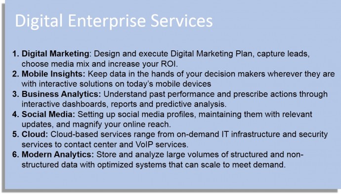
Bad, right? If you are presenting this slide on stage, there is no logic why you should be having complete sentences in each bullet point. The audience will read the lines faster than you speak them out, making you look dumb. So, ideally you should have 6 or 7 words in each bullet point summarizing the main idea; you can elaborate upon them via your talk. The edited bullet points would then read as:
- Design and execute a digital marketing plan
- Give decision makers access to Mobile Insights
- Understand Past Performance and Prescribe Actions
- Setup up and manage Social Media Profiles
- Deploy Cloud Based Services
- Leverage Big Data Analytics
But assuming you are sending this presentation as a stand-alone file to be read at leisure by clients, we won’t play with your content. Instead, we’ll show you 15 hacks or ways to display 6 lengthy bullet points in style. Here we go:
Hack 1: Icon-ize the Bullet Points + Split Text into Columns
The easiest way to up the style quotient of your slide is to accompany your text with a corresponding icon. They hardly take any space at all, add visual interest to your slide and reinforce the message you wish to convey. What better do you want! It’s up to you to have vector icons that are fully editable or non-editable image icons. For this hack, split the content into aligned columns to give the modern look of a website to your slide. Just like this one:

We also have a Free PowerPoint Templates section on our site where you can download PPT templates, icons, maps and diagrams for absolutely free.
Alternate: Customize the Shapes of Icons for a Stunning Effect
Now that you have seen the difference icons can make to your slide, it’s time you go a step further and make the icons stand out more prominently. You can do that by using customized shapes as shown below and evenly space out your bullet points above and below those icons. You can download this awesome PowerPoint template and simply copy paste your text in the placeholders.
Hack 2: Convert to SmartArt
This is the least time-consuming hack of all. With a single click, you can convert plain text into eye-catchy graphics that visually communicate information. PowerPoint has built-in SmartArt feature with different types of professional graphics. These illustrations combine shape, line and text placeholders allowing presenters to show interdependencies of processes visually rather than through bullet points.
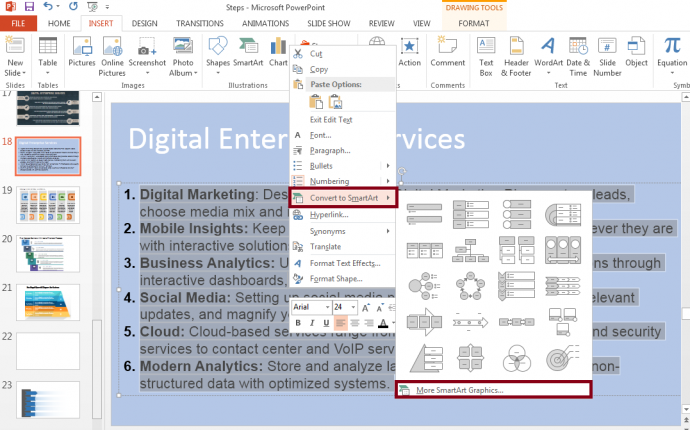
There are 2 ways to apply this hack. The first is to go to the Insert tab on the PowerPoint Ribbon, choose a SmartArt you like and paste your content in the placeholders. The second and easier way is to copy all the text, right click, select the Convert to SmartArt option (see screenshot below) and choose the graphic you like.
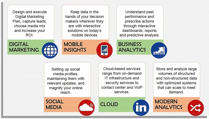
See how much better your slide now looks with a SmartArt graphic:
Hack 3: Split into Grid
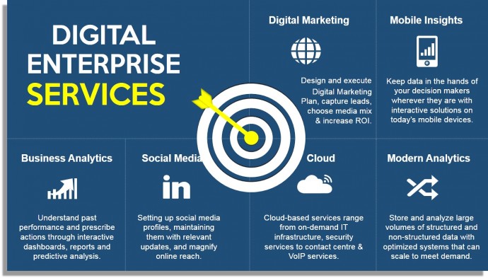
Give a neat, polished look to your text-heavy slide by simply creating a grid using lines. Choose the Line shape from the Shapes menu and format its style and width to create neat blocks. Place each bullet point in a grid along with its corresponding icon. Do ensure that you have some breathing space in each grid. Notice how in the slide below a dartboard has been placed in the centre of the slide to bring further visual relief to the text-heavy slide. Use strong contrasting colors for maximum impact.
Hack 4: Alternate the Colors in the Grid
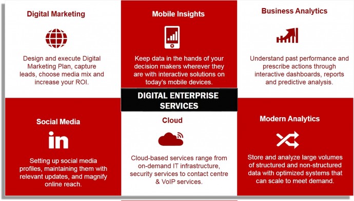
Unlike the previous hack, here you have to alternate the colors of the grids. You can choose the Rectangle shape from the Shapes menu and duplicate it until you have 6 equal compartments. Use two alternating colors to avoid having a color riot on the slide. So, like shown in the slide below, if you have chosen white and maroon as the alternating colors: you’ll be using maroon as the text fill in the white block and vice versa (white text fill in the maroon block).
Hack 5: Convert Bullets to Shapes
In this hack, you require no visual element at all. We will be using simple shapes with strong contrast to the background that will serve as visual element in themselves. See what we have done in the slide below: Divided the background into heading and text, in the content half added rectangular shapes, created a separate square shape for the bullet numbering and that’s it. The strong contrast rendered in the slide makes it awesome, and not a word was sacrificed in the process.
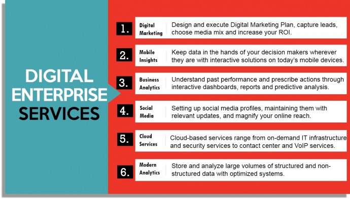
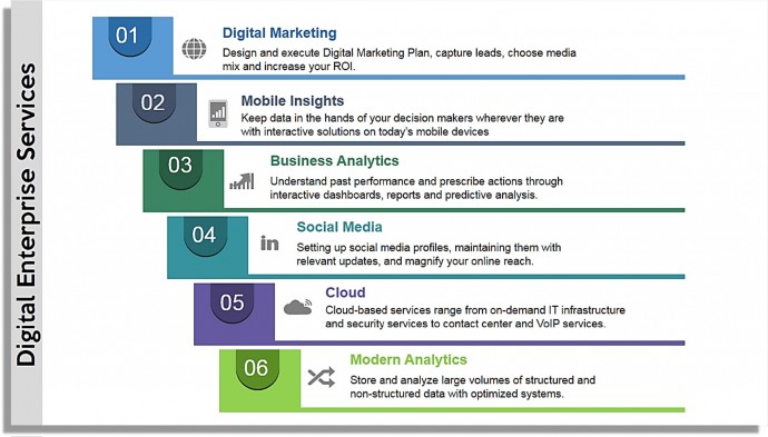
Here’s another design that can be created using these hack. All we have done here is add rectangular boxes for each bullet number and add another thin rectangular line to separate each bullet point.
Hack 6: Divide each Bullet by a Dotted Line
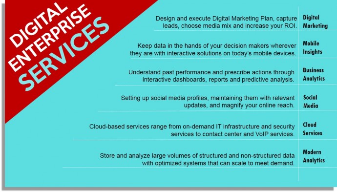
Simply separating each bullet point by a divider like a dotted line changes the look of your slide. A line separator creates 6 different chunks of text making them far easier on the eye than one long passage as was before. Rather than following the top-down approach of title-above-text-below, you can rotate the title to create a dynamic look. You can further separate the headings of the bullet points from the description with another line separator. Adding icons to each bullet point is your choice completely. In 2 minutes, you have created a far impressive slide than you started with.

Hack 7: Insert One Visual Element (a large icon)
This is similar to the above hack, the only difference being that we add one visual element that summarizes the main idea of the slide. You can divide the slide into title and text sections with a strong contrast. You may choose any image; however we recommend using an icon due to the simplicity of the illustration and its neat, transparent look.
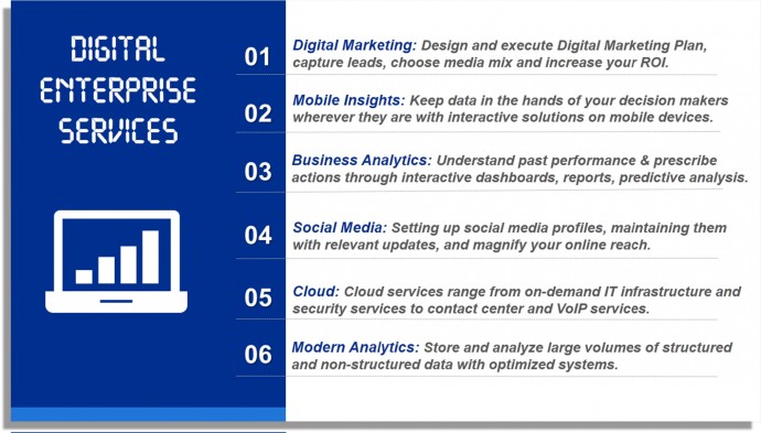
Alternatively, you can choose a white background and give a strong contrasting background to the text boxes and the icon. As you can see in the slide below, the calendar bullet points enhance the look of the slide greatly. It’s very simple to create such customized shapes- all we have done is first drawn a blue square, superimpose a white square over it and add two small white boxes with colored outline to depict the wire binding. With a little effort, you can create this amazing slide.
If you love the drop shadow effect given to the icon in the slide below, you can download such icons from the SlideTeam website. Creating them on own is a little tricky and we’ll be sharing this trick in our upcoming posts.
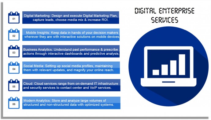
Hack 8: Go for a Circular Template
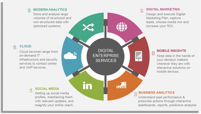
Circular processes look elegant and are very easy to understand. Microsoft PowerPoint has built-in circular SmartArt graphics that can be tried out for your presentation. If you want more professional and eye-catching circular diagrams, you can choose a professionally-designed template. The advantage of such templates are that they are fully editable. You simply have to paste your content in the placeholders and change the colors to match your company’s brand.
For instance, we used one of our professional templates to display services in the style of spokes of a wheel.
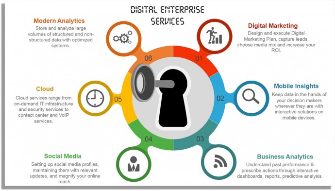
Here’s another professional template that gives an impression of unlocking your company services. The icons and perfect distribution of content around the slide canvas makes for a pretty impressive look. Using simple “Appear” animation, you can show each service one by one and keep the audience hooked to your presentation.
Hack 9: Semicircle Layout
Semicircles or half circles look as powerful, if not more, as complete circles. They are perfect to present the different segments of your audience, departments, services, etc. Creating a semicircle in PowerPoint is not tough, dividing it into segments and giving a different color to each segment is however a little tricky task. Here’s one workaround: Insert a Pie Chart from the Chart menu, divide it into 12 segments (say you give 10 value to each), save that piechart as an image and crop the bottom half. That way, you will be left with 6 equal segments with 6 different colors and a semicircle!
Or save yourself this trouble by downloading a semicircle template and pasting your content in the given placeholders. Here’s one semicircle slide design with world map as background- the perfect fit for any business services slide:
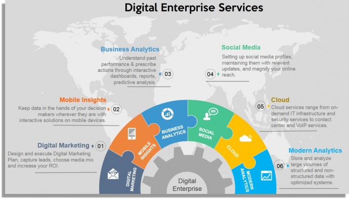
Hack 10: Half Page Image Layout
This layout uses the perfect balance of visual and textual content on your slide. We had shared this hack in the last Hackathon post Turn Boring PowerPoint Slides into Visual Masterpieces using 11 Image Hacks . The only thing that has changed here is that we are dealing with a lot of text.
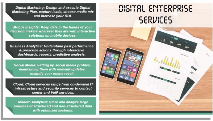
A great way to present each bullet point is to show it via the ‘Folded Corner’ shape. You do not need to invest any time in creating these. It’s available in PowerPoint itself! Simply go to the Insert tab, open the Shapes menu and choose the Folded Corner shape from Basic Shapes . We picked the dark green and light green colors from the image on right to create harmony and balance in the overall slide.
Hack 11: Full Page Image Layout
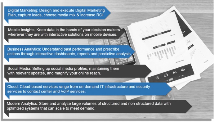
This is similar to the hack that we shared in Hackathon 2: choose an impressive visual, let it cover the slide canvas, and add transparency to the text box. But we are faced with the same challenge: Lots of text! Even if you add transparency behind the text, it will look a mess. What to do? Check out what we have done in the slide below.
First, we added an Artistic Effect to the visual . Here’s how you can try it: select the visual on your slide, click the Format tab on the PowerPoint ribbon, click the Color menu and choose the gray option. That gives an earthy and classic look to the image.
Second, Mask the Image using Gradient Fill . The steps remain the same as shared in the last Hackathon post . Let us repeat it for you.
- Insert a rectangle from the Shapes menu under the Insert tab
- Right click on the shape and click Format Shape
- Under Fill , select the Gradient Fill radio button
- Add two to three gradient stops and choose their color as white
- Keep decreasing the transparency level of each gradient stop (the first stop with transparency between 95-100%, the second stop with transparency between 40-50% and the last having transparency between 0-5%).
Third, Insert Arrows as Tags over the Slide . Here’s how you can achieve that: choose the Pentagon shape from the Block Arrows section in the Shapes menu. Place each bullet point in the block arrow. Insert the Right Triangle shape from the Shapes menu, rotate it by 180 degree, give it the same color as the arrow and place it on corner left, bottom of the arrow. That’s it. All your bullet points get converted into awesome picture tags!
Hack 12: Use a Professionally Designed Diagram
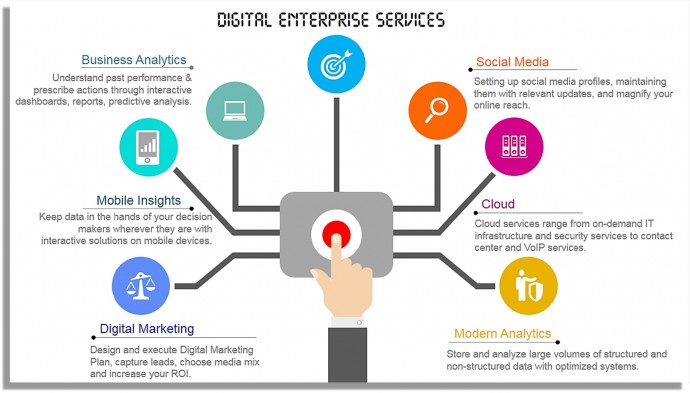
If you want to settle for nothing less than the best, go for a professionally designed diagram. In a few dollars, you can choose a ready-to-use template, put your bullet points in the placeholders and present it. Professional designs are also the best solution when you face a time crunch. The fonts, colors, layout etc. are all well taken care of. Check out the professional template below which is the perfect fit for the digital enterprise slide:
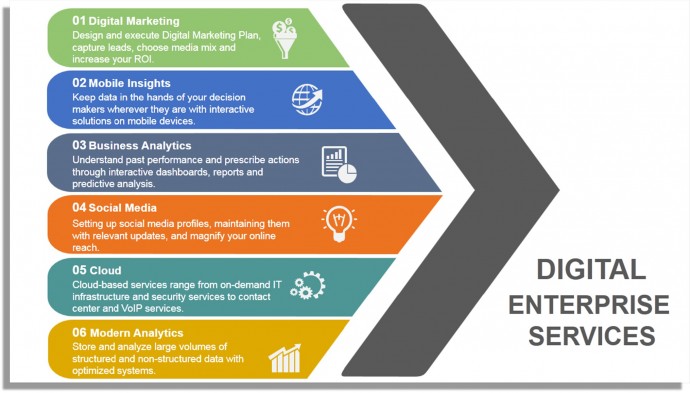
Here’s another professional design that uses elegant shapes to give the impression of moving forwards and driven towards achieving the goal.
P.S. If you are an academician and are presenting education services, a tree diagram will be the perfect design for your slide.
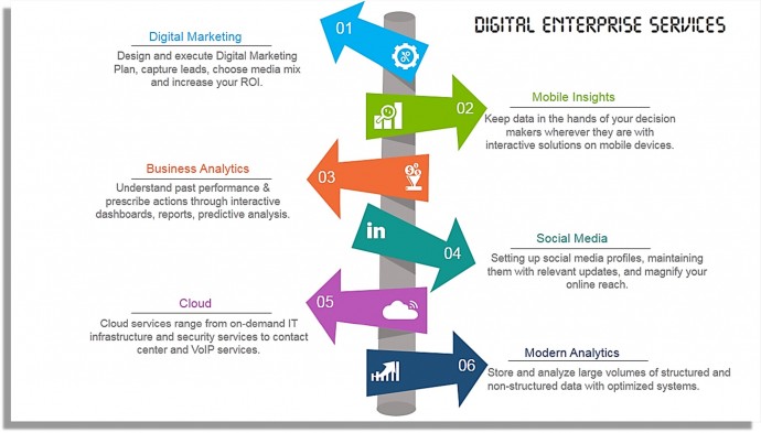
Hack 13: Split the Bullets into Left & Right
Much like a timeline or signboard, you can draw a straight line in the centre of the slide and split the bullet points on the left and right side of the line. This sobre yet elegant design is easy on the audiences’ eye and very professional at the same time. It’s pretty easy to create a timeline on your own using basic lines and rectangular boxes.

Or you can use a readymade signboard design like the one we have used below:
Hack 14: Use a Textured Background + Left-Right Partition
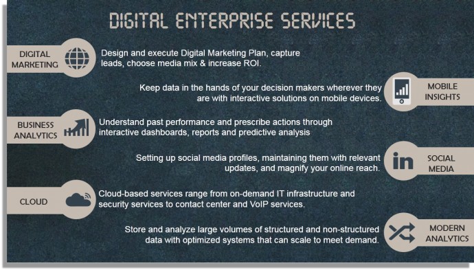
You can give an academic touch to your slide by using a blackboard texture in the background. PowerPoint has several default textured backgrounds which you can try. Simply right click on the blank slide, click Format Background and further select the Picture or Texture Fill radio button. Bullet points on the same textured background do not look ugly, because of the vibrant slide canvas. You can make the points more visually appealing by alternating them left and right.
As you can see in the slide below, only basic shapes have been used to highlight the headings of the services. A basic rectangular box merged with a circle are all that has been used. This may not be the best design of all hacks but it is definitely far, far superior to what we started with.
Hack 15: Present Text in Linear Fashion
Again a very simple hack. In the slide below, basic rectangular shapes have been taken and put together linearly. Within each block, a rounded rectangle taken from basic PowerPoint shapes menu, has been added. You need not create six different blocks; create it once and keep duplicating till you have six for each of the bullet points. Use the lighter and darker versions of each color to give a color-rich yet soothing look and feel to the slide.

Phew! We have to end here, not because we are out of ideas but because the possibilities are endless. The list of hacks we have provided you are decent enough to create not just good but awesome slides.
Now that you know there are so many ways to show your bullet points, we hope you won’t go for that boring-to-death, bullet-ridden slide. Your audience won’t forgive you if you still do! 😀
P.S. If you don't have time to revamp your boring slides, send your rough PPT to our PowerPoint Presentation Design Services team and get a polished, visually stunning presentation in 48 hours.
Which hack or hacks did you like the most? Tell us in the comments below.
Related posts:
- How to Quickly Find the Best Content for Your Presentation on SlideTeam
Presentation Hackathon Part 1: 5 Incredibly Simple Hacks to Create Stunning Slides
- Turn Boring PowerPoint Slides into Visual Masterpieces using these 11 Image Hacks [Presentation Hackathon Part 2]
- Split Image into Multiple Pieces to Create the Most Breathtaking Effect in PowerPoint
Liked this blog? Please recommend us

11 Dos and Don'ts of Using Images in Presentations
88 thoughts on “15 ways to turn a very text-heavy, bullet-ridden slide into amazing [presentation hackathon part 3]”.
This form is protected by reCAPTCHA - the Google Privacy Policy and Terms of Service apply.

Digital revolution powerpoint presentation slides
Sales funnel results presentation layouts
3d men joinning circular jigsaw puzzles ppt graphics icons

Business Strategic Planning Template For Organizations Powerpoint Presentation Slides

Future plan powerpoint template slide

Project Management Team Powerpoint Presentation Slides

Brand marketing powerpoint presentation slides

Launching a new service powerpoint presentation with slides go to market

Agenda powerpoint slide show
Four key metrics donut chart with percentage

Engineering and technology ppt inspiration example introduction continuous process improvement
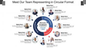
Meet our team representing in circular format


Blog – Creative Presentations Ideas
infoDiagram visual slide examples, PowerPoint diagrams & icons , PPT tricks & guides
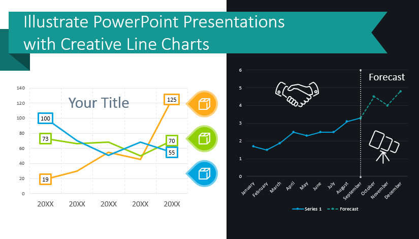
Illustrate Data-Heavy PPT Presentations with Creative Line Charts
Last Updated on February 27, 2023 by Peter Z
Are you presenting a data-heavy topic? If you are presenting sales trends or product demand forecasts or manufacturing performance, you can give more impactful presentations with cohesive, creative graphs. You can avoid falling into the same old pattern of repetitiveness by using sharp, modern graphics. Elegant line charts can elevate your presentations and help your audience follow complicated presentations on difficult topics.
Ways to use line charts
Going beyond basic Excel charts will help you present and translate data through graphics. Line graphs can come in many forms. Forecast charts, product trends layouts, and comparison charts are just 3 ways line graphs can manifest.
Want to see the full set for showing data trends over time and inspire your own presentations? Check Data-driven Line Chart PPT Graphics by clicking here .
Many data visualization options exist, especially when using line and area graphs. Let’s see where and how we can use line charts.
Show actual sales and predict sales forecasts
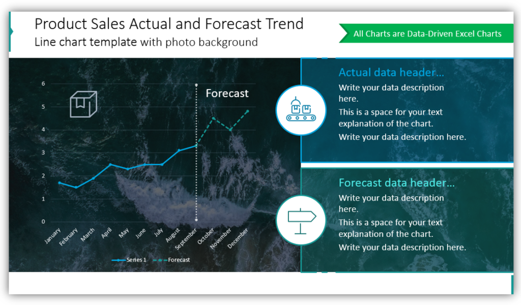
In this example, we placed the line graph over a photo background. Using an image as a background, rather than a plain, solid color makes your slides more engaging and interesting. Notice this setup permits describing both actual data and forecasted data. If you choose to present just one or the other on a given slide, you could easily customize the display.
Present comparisons and forecasted data with line charts
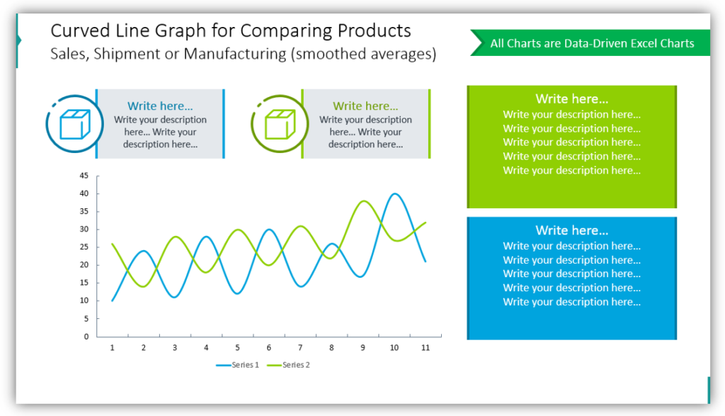
This simple comparison line plot with forecast shows both factual data and forecasted data. The white background helps keep the presentation clean and less complex. Maintaining visual simplicity is important. Especially when explaining complicated comparisons of variables. Color coding will help you build visually-appealing charts that are easy to understand. Customizing the slide further with icons to represent the variables you’re presenting will further help.
Use line charts with data labels for a product series
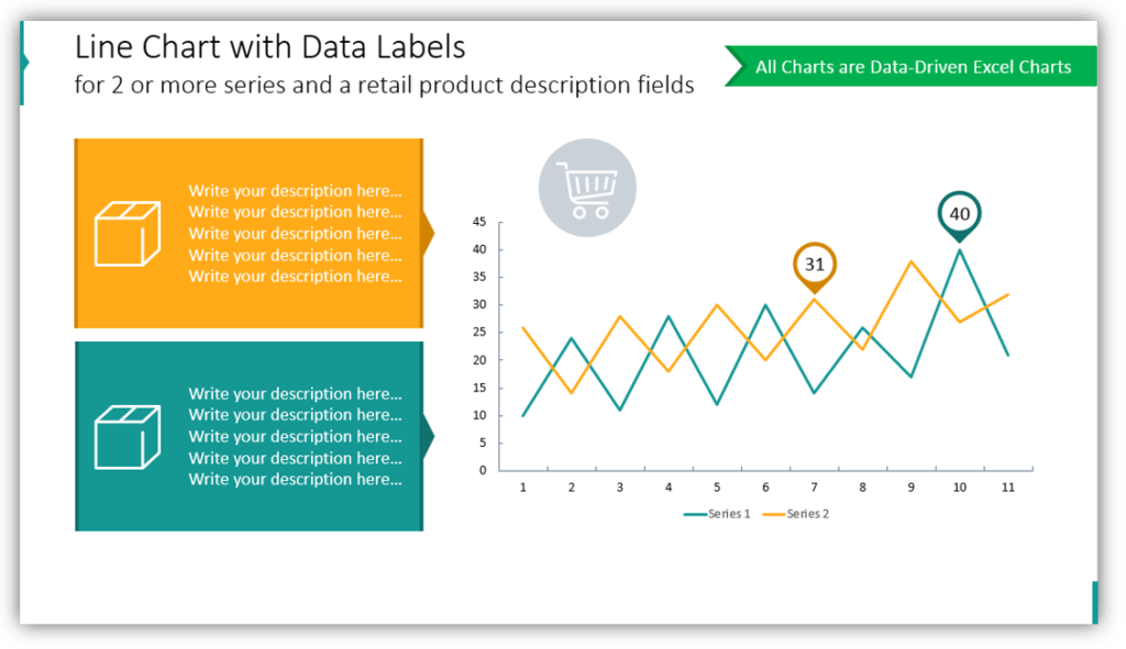
Do you need to present the performance of the two products? Use data-driven Excel charts to generate line charts. Adding descriptions of the products will offer more context. This becomes more important with each product you add to the presentation, put max up to five products or categories on one chart. Keep your charts concise and easy to understand.
Explain your sales volume or traction line
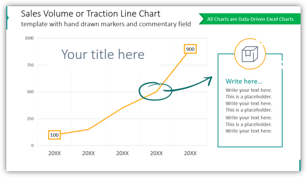
When you need to break down your sales volume or highlight a particular point, a line chart can be very beneficial. In the example, the point where sales volume changed is marked with a round hand-drawn marker with an arrow directing the audience to the description of the explanation. This user-friendly approach is simple to build with pre-made icons.
Create an Area Chart to compare 2 data series
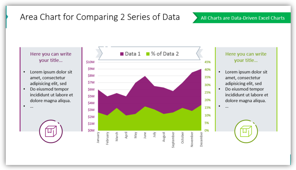
You can use the same data from line charts to create area charts, instead. Data can overlap which will help you demonstrate how different data sets differ. When you leave boxes on either side for details and descriptions. Make short notes for yourself, data highlights you’d like to make sure to mention.
Graphs and charts make a difference
Whether you’re using forecast graphs, comparison charts, or line graphs to represent product trends you can give an impactful presentation. Your audience will benefit from non-generic visuals that ‘pop.’
See our other article with data visualization examples and hints how to do chart PPT design customization .
Resource: Line Chart Data-driven Graphics
If you want to articulate Excel data in a professional way, line and area charts are a great way to accomplish that. Planning a presentation is time-consuming enough without worrying the results will not be eye-catching or helpful enough. Remove the guesswork with the pre-made graphics set:
Line Chart Data-driven PPT Graphics
Wish your presentations were cohesive? Use ready-made, non-default charts. You can customize them with icons from outline symbols set to ensure your slides are striking and informative.
Leave a Reply Cancel reply
Your email address will not be published. Required fields are marked *
Save my name, email, and website in this browser for the next time I comment.
Master Data Heavy Presentations with Shiv Misra
“Numbers have an important story to tell. They rely on you to give them a clear and convincing voice.” – Stephen Few
When making corporate presentations, telling a story with data is critical. Nothing sticks in your mind better than a story and communicating with numbers is no exception. In fact, shaping a narrative and communicating important themes through data is one of Shiv Misra’s favorite ways to connect with his audiences. As the head of analytics and member retention at CVS Health, Shiv is no stranger to data-heavy presentations. In our eighth podcast episode, Storytelling with Data , he reveals that your audience shouldn’t have to work to understand your presentation’s key takeaways. Better yet, you should try not to make your listener think at all!
Here are Shiv’s top tips for stepping up your data storytelling skills.
HARMONIZE YOUR DATA
Data harmonization is the process of making sure all your data sources are in sync with each other. In other words, this means that throughout your mission to discover different studies and sources that will convince your audience, you should prioritize collecting compatible data that can be visualized altogether . This gives your audience an easy-to-follow comparison chart combining everything in one place. It’s also a great opportunity to visualize the data in a holistic, 360° view. In addition, it enhances comprehension and inspires more powerful insights from your audience.
EXPLAIN WHAT YOU’VE DONE
Rather than opening your business presentation with the main takeaways, start by explaining what you’ve done. This helps build trust with your listeners. It also helps them appreciate what, why, and how you’ve achieved your goal.
From here, big numbers like ROIs and KPIs become super important. Keep your story relevant, exciting, and never end it with a happy ending or a pretty bow on top. Instead, end with next steps and how your audience can get involved. Rest with the answer to questions like “So what?” or “Why should this matter to me?” Make sure that whatever you’ve done is translated to everyone and that they have clear motivation to welcome what you’ve said.
STEP INTO YOUR AUDIENCE’S SHOES
Don’t be afraid to be vulnerable and step into the shoes of your listeners. Recognize that you’re the expert on the subject you’re presenting and that not everyone will have your level of understanding. In fact, most people won’t! This will help give you important context and insight into how your audience’s brains work. What are they interested in? What do they care about? What impresses them? You can only discover the answers to these critical questions by stepping out of your comfort zone and into the mindset of your listeners.
The key to any great data-heavy presentation is making sure the numbers tell a story. Add these powerful recommendations into your next corporate presentation to make your data sing. In the meantime, you can catch up on the full Shiv Misra episode here .
Like what you're reading?
3 key tips for delivering data
Get your team on prezi – watch this on demand video.

Chelsi Nakano April 11, 2017
Data-heavy presentations are the absolute worst. If you’re being presented to, all those percentages are hard to sit through. If you’re the presenter, you’ve spent precious time putting together something that’s hard to sit through. Bummer.
When sharing your facts and figures on stage or as part of a larger story, be sure not to treat the experience like it’s a report. Follow these three tips for delivering your data in a way that will resonate and be remembered.
Show it off
Don’t flip through your figures too quickly. When you pull up a chart or visual stat, leave it up and talk about it. This gives your audience a chance to let your message sink in. Explain what the chart says, then explain what it means for your audience. The longer you have your message up, the better chance you have of getting your audience to remember what you’re saying.
Avoid back-to-back charts
No matter how impressive the stats, too many charts can be overwhelming. Avoid sharing back-to-back charts and graphs when you present data. Instead, switch up the variety of your visuals to keep people engaged and curious.
Along that same vein, try to only show one chart at a time. The more data you display at once, the harder your audience has to work to comprehend your message, and the more distracted they will become. The last thing you want is for your audience to tune you out.
Use color to clarify visuals
We know you have a lot you want to share, but it doesn’t help anybody if your presentation is hard to read. Instead of jamming a ton of information into the same space, highlight one or two significant points, so people know exactly where to focus their attention right off the bat. Using color in your presentation is a great way to achieve this.
Ready to make your data-centric visuals and presentations more engaging? We’ve got just the thing: watch the recording of our live session with the design experts at Alimat on snore-proofing your data.
You might also like
Do this, not that: the sales pitch, do this, not that: the proof of concept, 5 prezi next templates for the workplace, give your team the tools they need to engage, like what you’re reading join the mailing list..
- Prezi for Teams
- Top Presentations

IMAGES
VIDEO
COMMENTS
How to Give a Data-Heavy Presentation. Data storytelling has become a powerful part of the communications toolkit, allowing both journalists and marketers to communicate key messages by using data ...
Overall, McKinsey does a good job of showing a lot of data in a small space by having a strong title, choosing the right chart, organizing the information into clear sections, and bolding the important parts of the text. In this post I'm going to break down a realistic consulting slide from McKinsey. I'll show you how they're able to show ...
2. Keep slides simple and clean. Viewers prefer image slides over text slides. Make sure images such as charts and graphs are well marked and readable. Also, keep image slides free of additional ...
Looking for designs to make your text-heavy presentation pop? Creating a presentation that conveys lots of information — but also looks amazing — can be tricky. But — if you want to avoid a sea of bored or confused faces staring back at you, it's definitely worth the time and effort.
In this video Paul takes a critical look at data heavy PowerPoint slides from McKinsey, BCG, and Bain to see what he can do to make them even better. Designi...
The following list can be a good starting point towards understanding the full power of this skill. 1. Know the story behind the data. It's unfair to expect your audience to make sense of hard data when you yourself can't comprehend it. As a presenter, it's your job to dissect a piece of information before presenting it to your listeners.
Luckily, PowerPoint has many smart data visualization tools! You only need to put in your numbers, and PowerPoint will work it up for you. Follow these steps, and I guarantee your presentations will level up! 1. Collect your data. First things first, and that is to have all your information ready.
How to Give a Data-Heavy Presentation. By: Alexandra Samuel. Tell a clear story with your numbers. Length: 1383 word count; ... Analytics and data science Power and influence Presentation skills. Source: Harvard Business Review Digital Article. Product #: H02FHD-PDF-ENG . Length: 1383 word count. Higher Education. About Us;
For data-heavy presentations, this is especially important— more on this point in the next section. Stay Focused: Respect the audience's time and attention, and resist the urge to stray off-topic or delve into unnecessary details. A focused presentation is concise, relevant, and direct — it demands clarity in thought and delivery, and ...
To hold an audience's interest in a presentation, less is always more. Choose the data you include carefully, make sure it really helps to tell your story, and is clear and concise enough to do that. You can always hand out supplementary info after the presentation. Any data that is used on your slides has to earn it's right to be there.
For describing people of the team or management team of the organization, success journey, customer services and feedback, etc., you can use silhouettes and slideman infographics. Icons are the best way to demonstrate more information with less text. 4. Convert Long Paragraphs into Bullets. Break long paragraphs into small, readable, and ...
Not all presentations can be full of thought-provoking photos. Many times you need to present data — lots of it. While I do think that presenters sometimes dump more than necessary on audiences, consider this scenario that demonstrates how good handouts can save the day. The Setting You're a market research associate. A product marketing
The key to any great data-heavy presentation is making sure the numbers tell a story. Add these powerful recommendations into your next corporate presentation to make your data sing. In the meantime, catch up on the full Shiv Misra episode here. Share : Get the latest from Prezent community.
Solution 2: Send to Word. For more flexibility, you can create your handout by sending the presentation to Microsoft Word. Follow these steps: In PowerPoint 2013, choose File, Export, Create Handouts and click the Create Handouts button. In 2010, choose File> Save & Send> Create Handouts> Create Handouts. In PowerPoint 2007, choose Application ...
1) Create "data images". One of the ways you can make your data points more interesting is by turning them into images. Imagery makes numbers concrete, giving your audience a picture they can ...
Researcher and author Alexandra Samuel, author of "How to Give a Data-Heavy Presentation," has developed practical tips to help presenters deliver more compelling data-driven online presentations.
Presenting the results of your data analysis need not be a hair pulling experience. These 20 free PowerPoint and Google Slides templates for data presentations will help you cut down your preparation time significantly. You'll be able to focus on what matters most - ensuring the integrity of your data and its analysis.
Leverage Big Data Analytics . But assuming you are sending this presentation as a stand-alone file to be read at leisure by clients, we won't play with your content. Instead, we'll show you 15 hacks or ways to display 6 lengthy bullet points in style. Here we go: Hack 1: Icon-ize the Bullet Points + Split Text into Columns
Are you presenting a data-heavy topic? If you are presenting sales trends or product demand forecasts or manufacturing performance, you can give more impactful presentations with cohesive, creative graphs. You can avoid falling into the same old pattern of repetitiveness by using sharp, modern graphics. Elegant line charts can elevate your presentations and help your
"Numbers have an important story to tell. They rely on you to give them a clear and convincing voice." - Stephen Few When making corporate presentations, telling a story with data is critical. Nothing sticks in your mind better than a story and communicating with numbers is no exception. In fact, shaping a narrative and … How to Rock Your Next Data-Heavy Presentation Read More »
Avoid back-to-back charts. Grab their attention by making your presentation more interactive. No matter how impressive the stats, too many charts can be overwhelming. Avoid sharing back-to-back charts and graphs when you present data. Instead, switch up the variety of your visuals to keep people engaged and curious.
Related Topics: Analytics and data science, Presentation skills, Power and influence, Close × Summaries and excerpts of the latest books, special offers, and more from Harvard Business Review Press.
Here we collected some of the best examples of data presentation made by one of the biggest names in the graphical data visualization software and information research. These brands put a lot of money and efforts to investigate how professional graphs and charts should look. 1. Sales Stage History Funnel Chart.
Market Data Collapse menu. Earnings Calendar; ... Results - Earnings Call Presentation. Apr. 30, 2024 1:10 PM ET Stepan Company (SCL) Stock. SA Transcripts. ... heavy capex spending. 4.